Some Visualization Theory
Visual Analytics for Linguists
ESSLLI 2014
Chris Culy
revised 7 August 2014
3 Possible goals for a visualization
- Exploration
- Analysis ("Comprehension")
- Presentation ("Communication")
Pipeline Model
The (conceptual) structure of a visualization
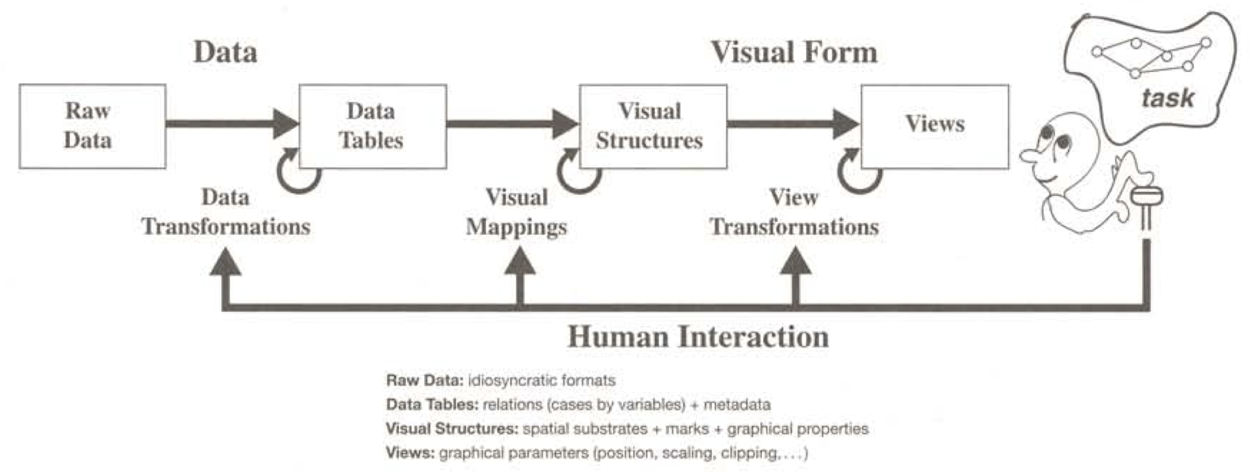
Reference:
S. Card, J. Mackinlay, and B. Shneiderman. 1999. Readings in Infomration Visualization: Using Vision to Think. Chapter 1.
3 Key ideas for visual representations
-
Gestalt Principles:
The tendency to perceive elements as belonging to a group, based on certain visual properties -
Pre-attentiveness:
Certain low level visual aspects are recognized before conscious awareness -
Visual variables:
The different visual aspects that can be used to encode information
Gestalt Proximity/Density
"Things that are close together are perceptually grouped together."
|
|
Elements of similar density are perceptually grouped together
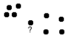
References:
C. Ware. 2012. Information Visualization: Perception for Design. Chapter 6.
Gestalt Similarity
Things with similar shape, texture, or color tend to be grouped together
•
•
•
•
•
X X O X X O X
References:
C. Ware. 2012. Information Visualization: Perception for Design. Chapter 6.
Gestalt Relative Size
Things with similar size tend to be grouped together
• • • • •
References:
C. Ware. 2012. Information Visualization: Perception for Design. Chapter 6.
Gestalt Connectedness
Things connected by lines are (strongly) grouped.
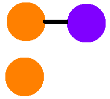
References:
C. Ware. 2012. Information Visualization: Perception for Design. Chapter 6.
Gestalt Symmetry
"Symmetry can provide a strong organizing principle."
Notes: "most sensitive" to small, vertically oriented
Especially reflectional symmetry and violations of it
References:
C. Ware. 2012. Information Visualization: Perception for Design. Chapter 6.
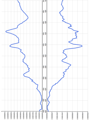
Graphs from Google Ngram Viewer
Other Gestalt Principles
- Continuity: "we are more likely to construct visual entities out of visual elements that are smooth and continuous, rather than ones that contain abrupt changes in direction"
Consequence: curved lines are easier to follow than bent lines - Closure: "A closed contour tends to be seen as an object" (and we tend to close contours with gaps)
- Common fate: Things with similar motion tend to be grouped (within limits)
References:
C. Ware. 2012. Information Visualization: Perception for Design. Chapter 6.
XXXXXXXXXXXX
XXXXXXXXXXXX
XXXXXXXXXOXX
XXXXXXXXXXXX
Pre-attentive, aka "pop-out", features
Certain visual aspects are very prominent, especially when they are relatively isolated against a background
-
"Low level" visual features are processed sooner and faster than higher level patterns
in V1 part of the cortex - color, grey, shape, size, length, orientation, motion, additional mark (+ others)
- Recognition is facilitated (biased) by higher level task and attention
References:
C. Ware. 2010. Visual Thinking for Design. Chapter 2
How to use preattentive features
- Target item(s) differ from the other items in the value of one (or more) low level feature
- Target items are few (1 is best)
- Other items and the background are relatively homogeneous
- Possible to have 2 separate targets, using 2 different features, one for each target
- Motion is a strong attention-getter
References:
C. Ware. 2010. Visual Thinking for Design. Chapter 2
/ / / / / / / / /
/ / / / / / / / /
/ / / \ / / / / /
/ / / / / / / / /
Look for these Os on the next slide
X
X
O
X
X
O
X
X
O
O
X
X
X
O
O
X
X
O
X
X
X
O
X
O
X
O
O
X
O
X
O
X
O
O
X
X
More details
- We are better at recognizing contrasts than absolute values
- Only ~ 3 levels of difference available for "pop out"
- Differences are not symmetric,
e.g. bigger than others is stronger than smaller than others - Detail (and most preattentive features) are best in the center of vision
motion is detectable everywhere
References:
C. Ware. 2010. Visual Thinking for Design. Chapter 2
Practically speaking ...
- Watch out for unintended Gestalt effects
- Put related elements near each other, with most important in center
- Make differences in visual values as large as possible
- Use positive difference for highlighting
References:
C. Ware. 2012. Information Visualization: Perception for Design. Appendix D.
Types of data
Data can be best visualized according to its type
- Nominal: no intrinsic order, e.g. words
- Ordinal: ordered in a sequence, e.g. words ordered by orthographic representation
- Interval: ordinal where gaps make sense, e.g. time
- Ratio: ordinal where proportions make sense, e.g. frequencies
References:
C. Ware. 2012. Information Visualization: Perception for Design. Chapter 1.
Marks and Visual variables
- A mark is "something that is visible and can be used ... to show relationships within sets of data"
- Visual variables are "the different ways that a mark can be varied"
Reference:
S. Carpendale. 2003. Considering Visual Variables as a Basis for Visualization. Research report 2001-693-16, Department of Computer Science, University of Calgary.
Marks: realizations of concepts
| Type | Concept | Realization |
|---|---|---|
| Point | Location only | By shape, size, color ... |
| Line | Location + length | By width, color ... |
| Area | Length + width in 2D | By color ...; also has size |
| Surface | Length + width in 3D | ditto |
| Volume | Length + width + depth | ditto |
Reference: Summary of:
S. Carpendale. 2003. Considering Visual Variables as a Basis for Visualization. Research report 2001-693-16, Department of Computer Science, University of Calgary.
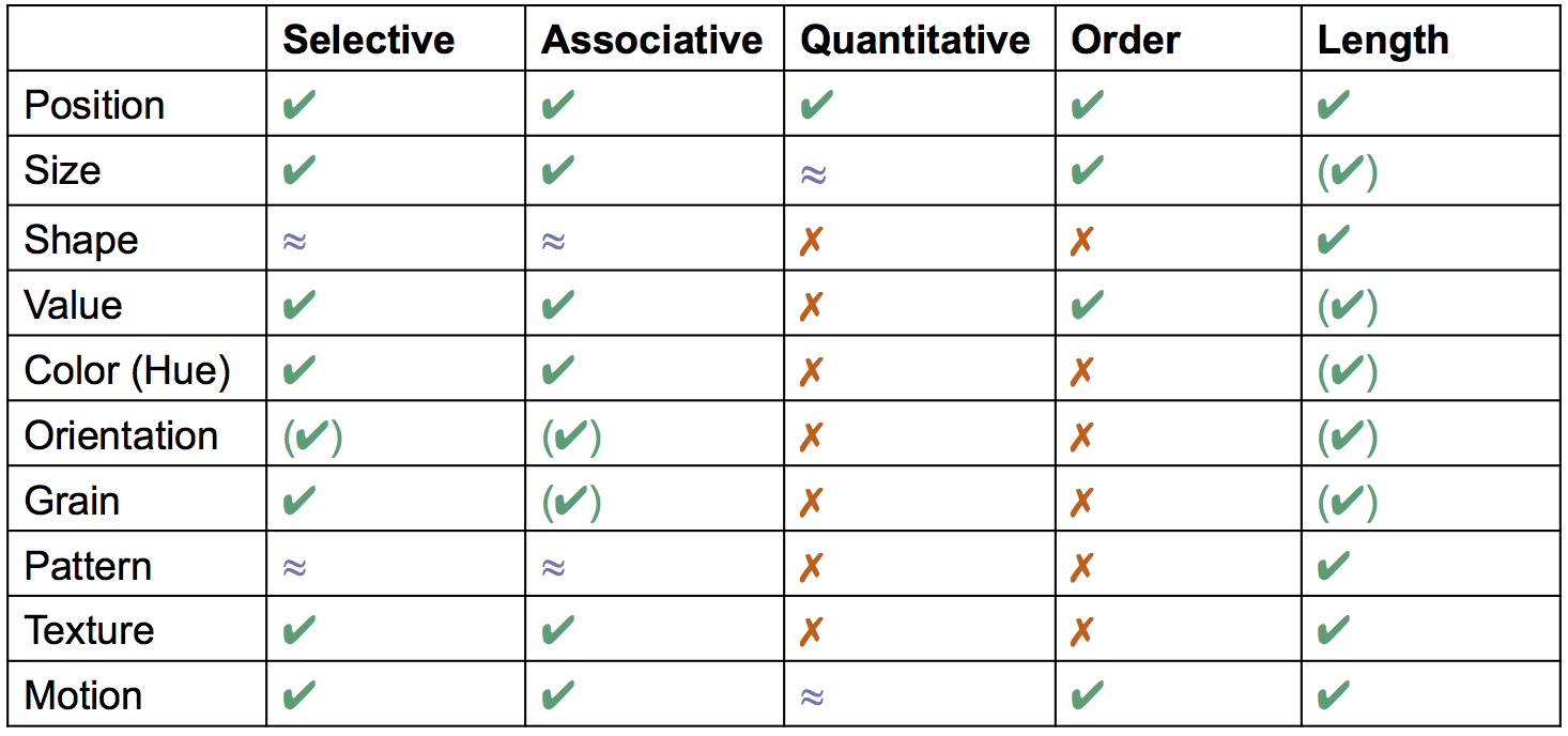
What are the (useful) visual variables?
Mostly the low level features, since higher level patterns take longer to process
Carpendale gives these as primary:
Position, size, shape, value (brightness), color (hue), orientation, grain (density), pattern, texture (surface appearance), motion
There are others that are less used, e.g. transparency, blur, occlusion ...
Reference: Summary of:
S. Carpendale. 2003. Considering Visual Variables as a Basis for Visualization. Research report 2001-693-16, Department of Computer Science, University of Calgary.
Characteristics of visual variables
These help us figure out how to use them
- Selective. CuC: Is X different from the others?
- Associative. CuC: Is X like the others?
- Order. CuC: Is X more/greater/bigger/... than Y
- Quantitative. CuC: How much is the difference between X and Y?
- Length. CuC: How many different categories can we represent with this variable for a task?
Reference: Summary of:
S. Carpendale. 2003. Considering Visual Variables as a Basis for Visualization. Research report 2001-693-16, Department of Computer Science, University of Calgary.
Visual variables
?
?
?
?
?
?
?
?
?
?
Reference: Summary of:
S. Carpendale. 2003. Considering Visual Variables as a Basis for Visualization. Research report 2001-693-16, Department of Computer Science, University of Calgary.
Practically speaking ...
- Don't use ordered variables for nominal data
- Use position for the most important information
- Many lengths are ~5 — a limiting factor
- For quantity, use (vertical) position, length, size, lightness, saturation(?)
- For many distinctions: use size, shape or brightness
- Redundant encoding may make features easier to interpret
but cf. Edward Tufte
Notes about color
Color is powerful, but there are special considerations
- Hue is nominal, but can be given (cultural) orderings (e.g. temperature, elevation)
- Affective connotations of color vary across cultures
- Depending on who your users are, you may need to design for colorblindness or low-vision
Allowing users to set colors / color schemes is the most flexible.
Resource:
Sim Daltonism: color blindness simulator for OS X
(There other tools, and for other platforms)
Practically speaking
- Use lighter, less saturated colors for larger areas
- Use darker, more saturated colors for smaller areas and lines
- For ordinal data, use darker and more saturated for higher values (e.g. heat map)
- Color (hue) length is ~6-10, so with more categories, color may not be an appropriate visual variable.
- Saturation has a length of ~3
- Ensure a luminance contrast of 3:1 for text.
Resource:
Color Brewer
How should visualizations interact with the user?
Shneiderman's "Information Seeking Mantra"
Overview first. Zoom and Filter. Details on Demand
Keim's Visual Analytics Mantra
Analyze first, show the important, zoom, filter and analyze further, details on demand
References:
B. Shneiderman. 1996. The eyes have it: A task by data type taxonomy for information visualizations.
Proceedings of the 1996 IEEE Sympoium on Visual Languages, VL '96.
D. A. Keim, F. Mansmann, J. Schneidewind, and H. Ziegler. 2006. Challenges in visual data analysis.
Proceedings of the conference on Information Visualization, IV '06.
What do users (want to) do?
- Select: mark something as interesting
- Explore: show me something else
- Reconfigure: show me a different arrangement [same type]
- Encode: show me a different representation [different type]
- Abstract/Elaborate: show me less or more detail
- Filter: show me something conditionally
- Connect: Show me related items
Some other things: history, annotate, extract
References:
J.S. Yi, Y.A. Kange, J.T. Sasko, J.A. Jacko. 2007. Toward a deeper understanding of the role of interaction in information visualization.
IEEE Transactions on Visualization and Computer Graphics. 13:6
B. Shneiderman. 1996. The eyes have it: A task by data type taxonomy for information visualizations.
Proceedings of the 1996 IEEE Sympoium on Visual Languages, VL '96.